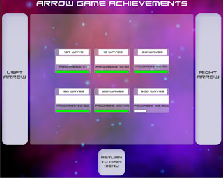
The nature of the game has me thinking more and more the level select feature is simply no fun. For now I've kept it in game in case I find a use for it, but as it stands, there is essentially no reason to use this mode when you can play arcade with more perks and essentially identical gameplay.
 |
The guns now animate when pressed, which took longer than expected to get working. The new animation system in unity is pretty powerful, and now that I've gotten used to it, it will prove to be very useful in the future. I am considering switching up the guns to have a single health bar rather than separate ones, amongst a few other gameplay features. Both the guns and combo zone will be updated in future; they are currently there as placeholders of what shapes I intend them to have.
Owing to the visual-heavy overhaul this week, there has been comparatively little code changed. However, given that the visuals are almost where I'd consider them presentable, I'll soon be moving on to more code-intensive tasks. The key to making the gameplay more exciting is most likely in the combos, so one of the bigger challenges going forward will be to find out a way to let the user rack up combos in a novel way using the simple input allowed to me on mobile platforms.
Another issue I've begun to run into is the standardisation of the screen layouts across different resolutions/aspect ratios. In the beginning I had designed the game with zero consideration to that, and I can now say with confidence that I'm glad I started to pay attention to it when I did. When the screen gets too large or too small, there is a lot of effort that has to go into essentially micromanaging the layouts. It isn't difficult or confusing, but it is tedious work, so I'd offer advice to any game developers reading this to keep up on that as you go along. It should likely be something you're considering during the whole development life cycle.


No comments:
Post a Comment