Friday, 25 September 2015

Three quick things I've learnt doing game development

It’s Friday again! Time for another blog update. Game news is slow, and I’ve been trying to explore various avenues for artist involvement again, but I’m beginning to think I won’t get anywhere without paying someone. The only concrete thought I have about my next project is that I definitely want to work with AI in some capacity. Perhaps some kind of simulation game. So, without much game news, I leave you with this: three things I’ve learnt so far during my time as an amateur game developer.

You will underestimate how long it takes

When I first became interested in game development, I did what I think every beginner has done at some point; I planned a project that was well beyond my scope. You tell yourself “I will work on it as long as it takes!” or some permutation of that sentiment. But you won’t.

If you get as far as actually starting the project, you will quickly realise that, without much experience, you have no idea how things work. 10 years commercial experience isn’t necessary to launch a successful game, but if your first idea is on the scale of an MMORPG, just forget it. There is a reason people start with pong.

The key to successfully launching a game - not necessarily a successful game, I’ll write a post on that when I’ve figured it out! – is more about what you don’t add, rather than what you do. You can have as grand an idea as you like, but your first version will be culled down to a husk of itself if you are to actually get any feedback.

You will gradually get better at estimating how long feature X will take, but you will never be completely accurate. Amateur game developers – particular those working in very small teams, or on their own – will almost always be well served if they plan for a game to take longer than they think it will.

You will learn something new every project

… and that’s good! This is exactly what makes game development interesting: the innovation. Had you learnt nothing on a project, you would have kept the exact same skillset. You may not have some extra portfolio work, but you can’t actually do anything new.

One of the best things an aspiring game developer can do is to learn new techniques. Expanding your skillset will undoubtedly increase the quality of your ideas, and your work. Modern day originality comes from the combination of ideas in novel ways, and you can’t combine an idea you do have with an idea you don’t. So get learning new stuff!

You need to draw out all the visual elements

I’m not sure this even needs to be said, it’s that obvious. Regardless I’m saying it because this tripped me up on more than one occasion. I’m a very cerebral person; I reason things out in my mind rather than draw them, or write them down. This process works very well for me when I do programming, but when I’m designing a UI, it’s nigh impossible to do it well without designing it first.

If, instead, you decide to just go ahead and slap a few buttons on the screen with an image here and a title there, you will come back to it. You will end up redoing the entire screen, and that’s time wasted. Granted, there is a use for quick mashups in prototyping, but if you are looking to actually ship a game, get some designs completed first.

Friday, 18 September 2015

Nearing the end, and musings on my next project

It's getting to the point now where working on Arrow Game ends up being more polish than adding features. This is good. This is what I want; it means I am not falling victim to feature creep and am instead focused on a presentable release. Quality over quantity echos my sentiments here.

I posted on reddit to see if any artists wished to collaborate with me in producing the sprites. I've had some interest, but no one has got back to me yet. Without an artist on board soon, I may switch over to my next project, and release this one with 'updated' programmer art. I will try to make it look as good as I can, but there will clearly be an upper limit. I don't wish to 'abandon' this project by any means, but without an artist, and within a portfolio type of mindset, I feel moving on soon will be best if I don't get artist support.

In actual game development news, I've been working on a small tutorial message that will pop up when the user first plays the game. It is there simply to explain what the ships do, how to get high scores, etc. See the picture below.


You simply click on the box to switch the message, the contents of which I control via a script, so it will be easy to generalise this if necessary to different tutorials. I've made two other visual changes here; one, I've reduced the saturation in the background nebulas. That came about as advice from reddit user Brosciusko, so thanks for that. The second is I've lowered the opacity on the combo zone and removed the text. Now that I have the tutorial in place to explain it, I think it looks better with the user barely noticing it, yet still being easy enough to see where to shoot.

The news about code is fairly banal; I'm essentially just going through the game resizing various components to make sure everything looks flush at multiple resolutions still. Simple but tedious work, however it's both nearly finished, and is starting to look good, so I'm thankful for that.

There are a couple of things I want to focus on for my next project. As the work I'm doing is not commercial, the focus here is on learning and improving my skillset. Any new skills require practice, so my next project will involve me using features of both unity and c# that I've never - or have rarely - used before.

Two things I would definitely like practice on that I found out from this project, are varying screen resolutions (Essentially keeping in mind the design considerations from multiple angles), and unity's animation system. The latter in particular is quite exciting, as I can see how powerful it could be, so I would like to explore what I can do with that.

Other things I would like to work with - and may or may not - include 3D and AI. AI in particular is a long term interest of mine, so I would like to begin learning new methods within that field. An obvious idea that jumps out to me is something like a hotel simulator. Create various different rooms, which are then managed by cleaners, staff on the front desk, etc. The hotel essentially automanages after you assign staff to particular rooms. The challenge on my end would be to create sufficiently clever - and stable - AI scripts to have the automanaging working correctly. The interest in 3D ought to be obvious; most everything worth playing is in 3D.

Friday, 11 September 2015

Arrow Game's Third Post

There has been a significant graphical overhaul this week, at least as much as I can do with my skillset. I'm using a 2048x2048 texture atlas which I'll gradually update with new graphics as I make them. A picture speaks 1000 words, so the following is what the game currently looks like;


The nature of the game has me thinking more and more the level select feature is simply no fun. For now I've kept it in game in case I find a use for it, but as it stands, there is essentially no reason to use this mode when you can play arcade with more perks and essentially identical gameplay.


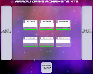
The rectangluar white bars are for achievement images. When you have yet to unlock it, I plan to show a simple lock icon, perhaps with the unlocked image almost imperceivably dark behind it. I am likely to leave this towards the end, or create a small amount of mockups to give the feel to the game, and then delegate to an artist in the future. I will also replace "Left arrow" with a < and vice versa.


The primary design overhaul comes thanks for the nebula particle system, and the enemy ship graphics. Credit goes to stilghar and Robin Gibson for those respectively. These designs aren't final by any means, but they represent some kind of evolution in the visual direction of the game.

The guns now animate when pressed, which took longer than expected to get working. The new animation system in unity is pretty powerful, and now that I've gotten used to it, it will prove to be very useful in the future. I am considering switching up the guns to have a single health bar rather than separate ones, amongst a few other gameplay features. Both the guns and combo zone will be updated in future; they are currently there as placeholders of what shapes I intend them to have.


Owing to the visual-heavy overhaul this week, there has been comparatively little code changed. However, given that the visuals are almost where I'd consider them presentable, I'll soon be moving on to more code-intensive tasks. The key to making the gameplay more exciting is most likely in the combos, so one of the bigger challenges going forward will be to find out a way to let the user rack up combos in a novel way using the simple input allowed to me on mobile platforms.

Another issue I've begun to run into is the standardisation of the screen layouts across different resolutions/aspect ratios. In the beginning I had designed the game with zero consideration to that, and I can now say with confidence that I'm glad I started to pay attention to it when I did. When the screen gets too large or too small, there is a lot of effort that has to go into essentially micromanaging the layouts. It isn't difficult or confusing, but it is tedious work, so I'd offer advice to any game developers reading this to keep up on that as you go along. It should likely be something you're considering during the whole development life cycle.

Friday, 4 September 2015

Arrow Game's Second Post

My focus is gradually switching to presentation of the game as I get more of the core gameplay mechanics in place. At this point I would say the game is close to the transition from alpha to beta stage, as the majority of features I'd planned for a MVP (Minimum Viable Product) are now in place and working. I've been told by a few close friends who routinely offer to test play the game that at this point it needs to begin getting development effort for the graphics. As such, I'll soon begin seeing if I can find a reliable artist to collab with.

Having worked on a few pet projects beforehand, I increasingly feel that the key to successful game development - or perhaps software development in general - is actually removing features. I've seen this sentiment echoed beforehand from a few sources, and in my experience it is perhaps the single best piece of advice I would give to developers, particularly those doing most, or all, of the code themselves. I'll likely write a short post with my thoughts on this in the future.

Level Select Screen


Achievements Screen


The focus on both the above menus is in the layout. I'm hoping that, with an artist on board, they can forget about how the programming will fit in with what they produce, and instead focus on creating the required visual elements as soon as they see the layout itself. Both screens use a similar paradigm to flip between each 'page', though I made them slightly different just for the experience.

I'm currently happy with the layout, as I feel it works on essentially all platforms that I'm interested at this point. I'm working on a Surface Pro 3, so I get to play the game with touch as I go along, and the larger buttons are definitely working.

The level select screen generates each button and assigns button commands at runtime. I had initially wanted to handcraft each 'page' of levels, but even after placing a single page it became obvious that, while simple, this was going to be very time consuming. Each group of 15 levels is a child element of gameobjects that are generated at runtime with layout components, and the arrows disable/enable the right parent object to display the correct levels.

The achievements screen instead uses a list of a class I handmade containing the relevant data structures to display what makes up an achievement. Internally there is a simple integer value that is increased/decreased by the arrows and, following that increase, enables/disables the achievements based on their position in the list.

Predictably, there's no performance benefits to either method at this level, but I would say the more easy to use/understand depends on the type of person you are. The method used in the level select screen allows you to see what's happening visually within the unity editor, but the code itself is mostly creating components, adding, and modifying them at runtime. The method used in the achievements screen is a little more abstract - being further removed from the component-based structure Unity employs - and instead focused a little more on the numbers. As a numbers person myself, I find the achievements screen is easier to get my head around, but only marginally.

Since the architecture for the majority of features is now in place, next up will be introducing more achievements, perks, and enemies. From experience this will be more of a design challenge than a programming one. However, I plan on adding a sort of 'pop up menu', to display little messages to the player. This will be used the first time they encounter new enemies to explain what they do, to tell them when they unlock achievements, etc. I feel that will be the most difficult part in the near future.

For anyone interested in numbers, there are, at this point, 18 separate scripts. They range from 50 lines to 500.